


In today’s digital landscape, where websites often serve as the first interaction potential clients have with your business, and in some instances the virtual storefronts of businesses, user experience (UX) plays a critical role in determining a website’s success. A good UX can captivate visitors, build trust, and boost conversions, while a bad UX can lead to frustration, inconvenience and the dreaded bad review. Read on for examples of both good and bad UX, and how you can take away as many barriers to purchase as possible, and build on the user experience to surprise and delight your audience.
1. Clear and Intuitive Navigation:
Good UX: Websites with well-organized and intuitive navigation enable users to find information easily. Clear navigation menus, logical page hierarchy, and descriptive labels make it easy for users to navigate through the site, find what they need, and understand where they are at all times.
https://leytonproperty.com.au/
https://www.mightykingdom.com/

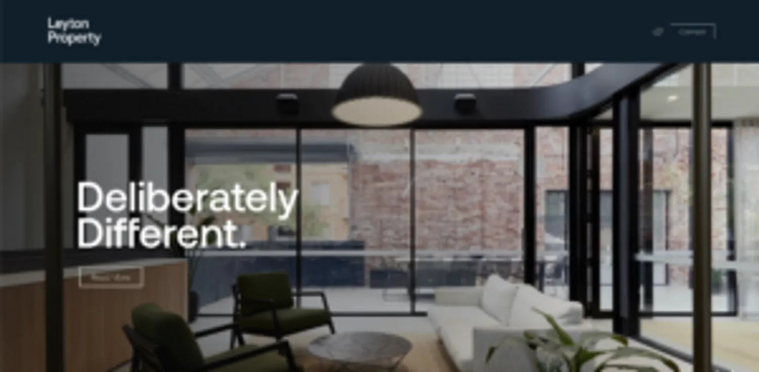
The navigation is straightforward, it is easy to navigate through the website, the text is big enough to read, and there is no overload of information and buttons.

Rundle Mall webpage is easy to navigate through, the filters are very detailed and allow users to narrow down their search to less and more accurate search results.However, the pages are quite busy and overloaded with information which may lead to confusion.
Bad UX: Poorly designed navigation can leave users feeling lost and confused. Websites with convoluted menus, unclear labels, or excessive subcategories can lead to very frustrated users. You know when you have to click 4 times to find what you’re looking for and you’re still not where you want to be? That. A lack of breadcrumbs or a confusing site structure can also impede users from finding their desired content. Be like Jack and Jill and make sure there is a trail that your customer can follow to lead them to the most important parts of your website.
Example
https://kenwell-flp.com/investment-advice-uk/

The drop down menu doesn’t scroll down on the desktop version on smaller screens which makes it impossible to choose the options below “Investment Advice”.
https://www.zara.com/au/en/woman-dresses-l1066.html?v1=2038184


The text is quite small, overlapping with the images. The menu button and other text on the main page were quite difficult to find.
2. Responsive and Mobile-Friendly Design:
Good UX: Most websites are primarily viewed on mobile devices, which should come as no surprise, so why are so many sites designed for desktop first and mobile second? With the rise of mobile usage, responsive design is absolutely essential for a good user experience. Websites that adapt seamlessly to different screen sizes and resolutions provide a consistent experience across devices (don’t forget tablet size!). Mobile-friendly designs optimize content, maintain readability, and ensure easy interaction, offering users a comfortable browsing experience regardless of the device they use. (and consistency of your brand)
Example
https://leytonproperty.com.au/

The text is clear, easy to read, the navigation menu is easy to use. The buttons are the good size, it is easy to find them and move within the website. The page design doesn’t differ from the desktop version
Bad UX: Websites that are not optimized for mobile devices can be difficult to navigate and read on smaller screens. Slow loading times, unresponsive buttons, and content that does not scale properly (text too small to read!) are all indicators of a bad user experience. Neglecting mobile users can result in high bounce rates and missed opportunities.
Example

Long loading times, different fonts and sizes, some text is too small to read.
3. Engaging and Accessible Content: (link back to accessible web design blog)
Good UX: Websites that prioritize engaging and accessible content make it easy for users to consume information and take desired actions. Well-written and concise copy, complemented by visually appealing images or videos, can capture users’ attention and keep them engaged. Additionally, websites that ensure accessibility by using alt text for images, providing captions for videos, and adhering to web accessibility standards, make sure that your content can be read and enjoyed by everyone. And with good reason, by 2023, digital products in full WGAC Level 2 compliance (Website Content Accessibility Guidelines) are expected to outperform their market competitors by 50%.
Example
https://www.mightynetworks.com/

Interactive page that keeps the users engaged, videos are quiet unless pressed on to play. Unfortunately the videos do not have subtitles but the speakers are clear and it is easy to understand their speech.
Overall it is a very interactive page with interesting features to keep the users on the page.

Beautiful, engaging, and very interactive website that will attract users attention and engage them with the info written on the page. The videos are clear, good quality and easy to play and pause at any time.
Bad UX: Websites with poor content organization, long paragraphs of text, or walls of unformatted content can overwhelm users. Lack of visual elements, such as images or videos, can make the site boring and uninteresting. Ignoring accessibility guidelines can exclude a significant portion of potential users, hindering their ability to navigate and interact with the site, and leaving the potential of those customers unharnessed.
Example
https://www.forbes.com/?sh=4b2545582254
The website is known for being too overwhelming with ads, amount of text, and disturbing amount of images to look at at once.
https://adelaide.craigslist.org/
Overwhelming amount of plain text, no images or videos, no visual appeal whatsoever.
4. Fast Loading Speed:
Good UX: Websites that load quickly keep users engaged, in this age of social media you have on average 8 seconds to do so. Optimizing images and videos, minimising server requests, and leveraging caching techniques can significantly improve loading times. A fast-loading website shows respect for users’ time and reduces the likelihood of visitors abandoning the site due to slow performance.
Example
https://leytonproperty.com.au/
https://hughhamiltonwines.com.au/
These websites are examples of fast loading pages. They load quickly, showing the images and text almost immediately.
Bad UX: Slow-loading websites frustrate users and can lead to high bounce rates. Excessive use of large media files, poor server performance, or bloated code can significantly slow down a website’s loading speed. Users who have to wait too long for a page to load are likely to leave, and we don’t want that!
Summary: Working with JP Media ensures an exceptional user experience with their expertise in UX design. As a full-service creative communications agency, they understand the importance of connecting through words and images. With a team of former journalists, news photographers, and experienced copywriters, JP Media knows how to captivate audiences and create engaging content. Their proficiency in strategic campaigns, digital platforms, and UX/UI design allows them to build websites that not only showcase your brand but also provide seamless navigation and intuitive interfaces. By partnering with JP Media, you can trust that your website will deliver a user experience that enhances your brand, engages your audience, and drives business growth.
In the digital world, you, as a website owner, understand the crucial role of user experience (UX) in determining your website’s success. A good UX captivates your visitors, builds trust in your brand, and ultimately boosts conversions. On the other hand, a bad UX can lead to frustration among users and result in negative reviews that impact your online reputation. This article delves into examples of both good and bad UX, shedding light on the key factors that contribute to each. It underscores the significance of clear and intuitive navigation, responsive and mobile-friendly design, engaging and accessible content, and fast loading speed. By prioritizing these aspects, you have the power to create a website that surprises and delights your audience, removing any barriers to their purchase journey and ensuring a positive user experience that sets your business apart.